XFA Specification
Chapter 12, User Experience
Widgets
349
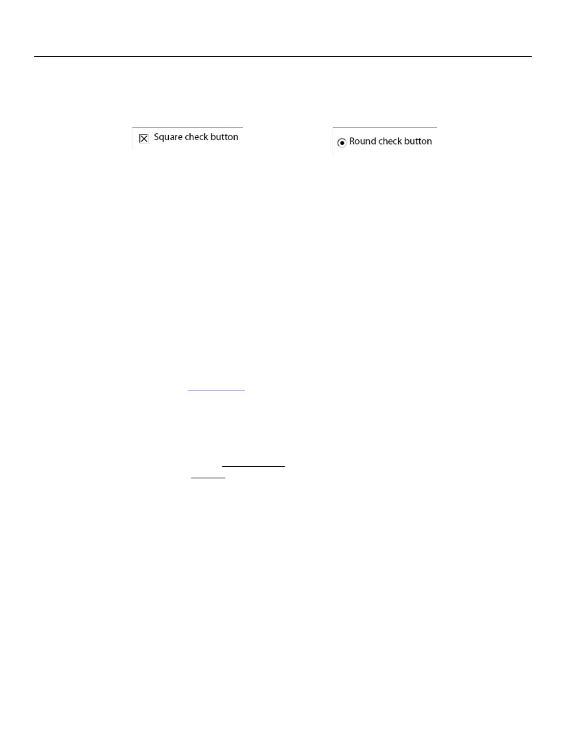
When the user selects the check button target, the widget fills in the target to indicate selection, as shown
below. The user may select the button by clicking on it or by pressing the enter key when the containing
field is in focus.
Check Buttons Not Contained in an Exclusion Group
Check buttons not contained in an exclusion group have the value "on" or "off". They may also be specified
as having a third value "neutral".
The check button widget cycles through the allowable values, as the user repeatedly selects the field.
Check Buttons Contained in an Exclusion Group
When multiple fields are contained within an exclusion group and each field contains a check-button
widget, those widgets interact so that at most one of the check-buttons within the exclusion group is on.
The check button widget supports only an on or off value for check buttons within an exclusion group,
regardless of whether the check button element specifies support for neutral (
allowNeutral="1"
).
Choice List
The choice list widget (
choiceList
of choice lists are also called drop-down lists.
Example 12.1 Basic choice list that provides a default and that uses selections as values
<field >
<ui>
<choiceList open="userControl | onEntry | always | multiSelect"
commitOn="select | exit"
textEntry="0 | 1" />
</ui>
<items save="1">
<text>apples</text>
<text>bananas</text>
<text>pears</text>
</items>
<value>
<text>apples</text>
</value>
</field>
The choice list widget has properties that affect how the widget behaves, whether it accepts user input,
and when it propagates selected data values to the XFA Data DOM.
Choice List Before Interacting with User
The choice list widget specifies the appearance of the widget before the user interacts with it. The
open
property specifies whether the widget choice list should always be visible (
open="always"
or