12
User Experience
This chapter describes the appearance and behavior or template User Interface objects. It also provides
guidance on using such objects to provide accessibility.
Widgets
This section describes the general appearance and behavior of the widgets specified by forms that
interface with a user.
As described in
“Size, Margins and Borders of Widgets” on page 55,
a widget refers to a simulated
mechanism displayed by the user interface to enable the user to enter or alter data. For example, a check
box displayed on a monitor, which checks or unchecks in response to a mouse click, is a widget.
If a field omits a widget, the XFA processing application selects a widget for the field, as follows:
●
Field has data. If the field includes default data or if the field is bound to data, the XFA processing
application assigns a widget that reflects the type of data.
Field is empty. If the field contains neither a default value nor is bound to data, the XFA processing
application assigns the text editing widget.
●
This default behavior is identical to that of the default UI widget, described
“Default UI” on page 352.
Barcode Widget
Note:
A description of this widget will be provided in a later release of this specification.
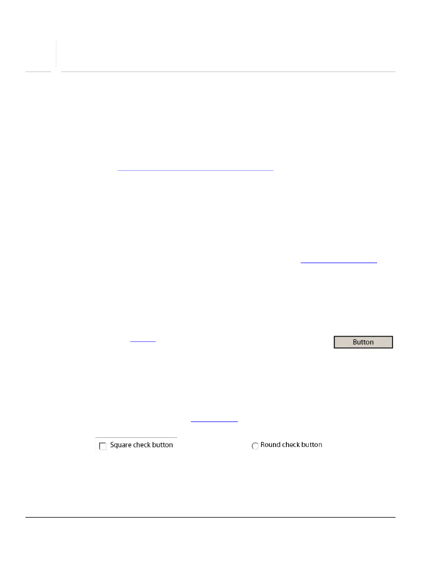
Button
The button widget (
button
click event. When the user selects the button, the click event is activated.
The button widget is commonly used to trigger a click event that submits a completed form to a server.
Button widgets do not provide a mechanism for entering a value for the parent field.
Check Box and Check Button
The check box or check button widget (
checkButton
enclosing field. The following are examples of the appearance of a check button widget.
348