XFA Specification
Preface
Conventions
xii
Graphical Conventions
Layout Drawing Conventions
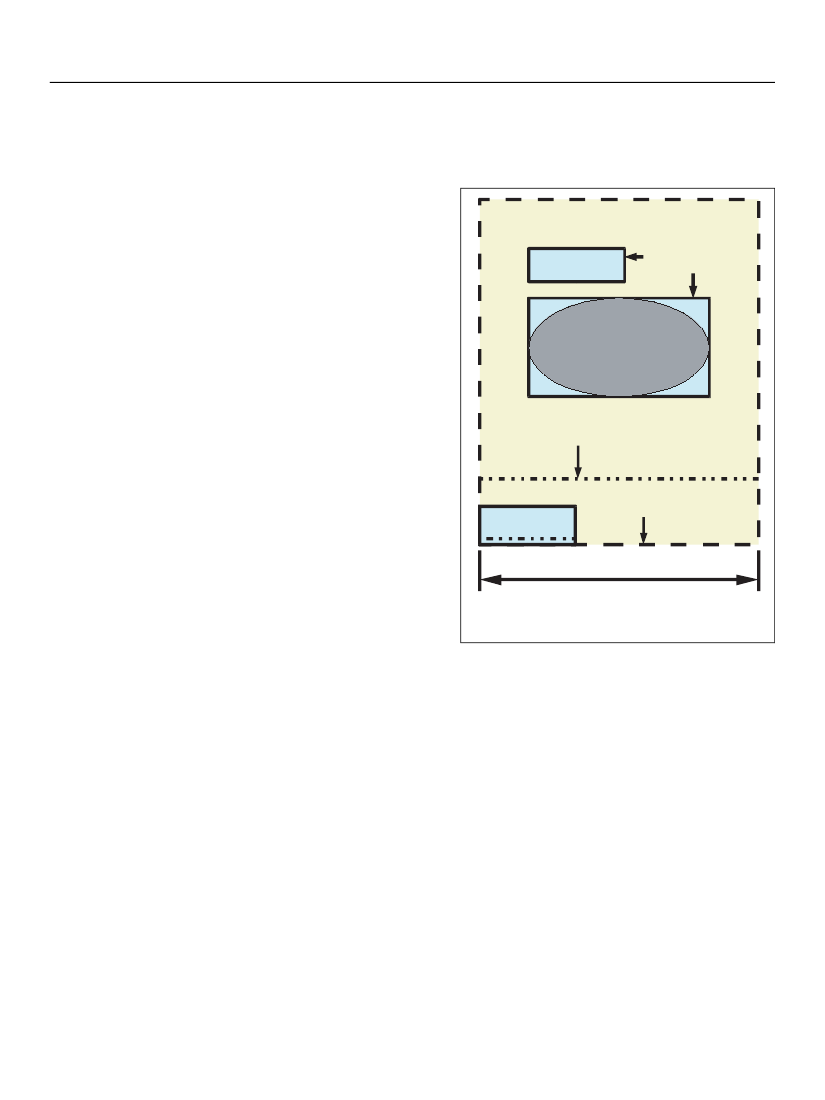
Some drawings in this specification portray
displayable objects, such as blocks of text,
positioned upon a page. Such drawings use certain
conventions which are illustrated at right. Each such
drawing represents a page or a portion of a page
resulting from a layout operation. Objects shown in
40% gray in the drawing would be actually visible on
the page when it was rendered. Objects shown in
black in the drawing give additional information
that would not be visible. In addition to the color
difference, visible text is shown in a serif typeface,
whereas other text is shown in a san-serif typeface.
Object boundaries are shown with dashed or solid
black rectangles. Dashed lines show the boundaries
of predefined physical layout regions on the page.
Solid lines show the boundaries of the nominal
extent for content that is displayed upon the page.
Neither of these boundaries would be visible on the
page. Some objects may optionally have visible
borders. The borders of an object may coincide with
the boundaries of the object’s nominal extent, but
they are not required to. To avoid confusion borders
are not shown unless relevant, and where they are
shown they are in 40% gray and offset from the
object’s boundaries.
label for contentArea
This is
displayable text.
boundaries of
layout-content
label for displayable
geometric shape
arbitrary line across
a layout-object
Fragment of
displayable text,
boundary of a
contentArea
dimension
line
Drawing conventions for drawings
illustrating layout
Some drawings show an object with a solid outline
and a dot-dashed line just inside, and parallel to, the solid outline. This represents a place where a single
original object has been split into two or more fragments during the layout process. Dot-dashed lines are
also used for arbitrary lines that have a meaning specific to the drawing. Dimension lines and extension
lines are solid.